Have you ever been stumped on what color ink to use on a specific color tee? Then this blog post is for you! We’re going to go through three different ways to pair colors, which will help you identify the best T-shirt color and ink combinations for screen printing and other decorating techniques.
We sat down with our Art Director to talk about these three color relationships and how they translated to our Heather Dusty Blue tee. Check it out below!
If you were to look at the color wheel, you will see that bright colors are on the outside. Every wholesale blank T-shirt brand offers these kinds of colors – the true royals, kelly greens, reds etc. As you move inside or outside the color wheel, you will find more unique shades, which is where BELLA+CANVAS likes to discover color palettes.
When you’re designing and figuring out how to choose the right color ink to pair with your T-shirt, you should have a good understanding of three basic color relationships.
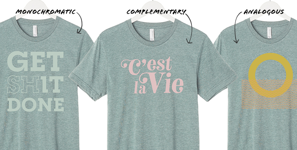
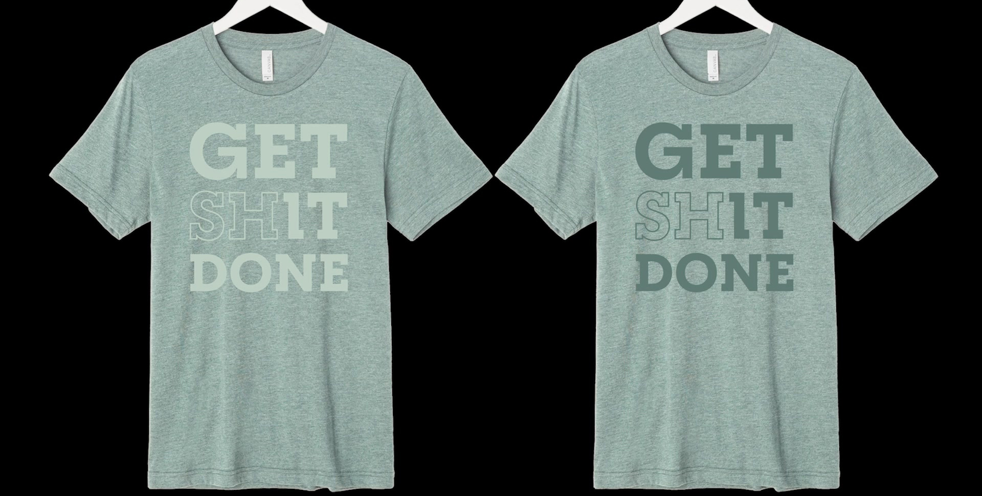
MONOCHROMATIC COLORS
A monochromatic color palette includes dark, medium and light versions of the same, single color. So if you want to create a design that is monochromatic, or as it’s commonly known in screen printing, do a tonal print, you’ll need to choose an ink color that is a tint lighter or shade darker than the shirt color.
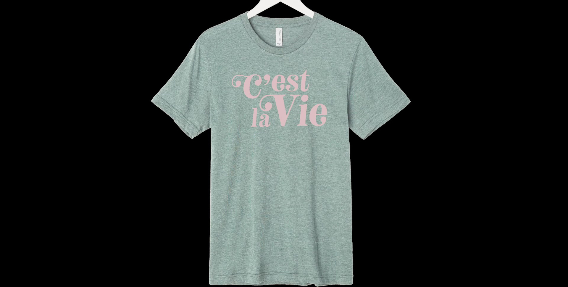
COMPLEMENTARY COLORS
Complementary colors are located directly opposite each other on the color wheel. This allows for the most dramatic contrast of all color relationships. Examples are red and green or blue and orange. A lot of sports teams use this color relationship, like the Los Angeles Lakers or New York Mets, because it really stands out. Of course, if you’re using a softer tint, it won’t be as drastic but it will still create a stark contrast. Michelle recommends that if you’re looking to do a complementary color relationship with your T-shirt design, don’t feel obligated to use those exact colors, but instead you can play with similar colors to create more of a softer look.
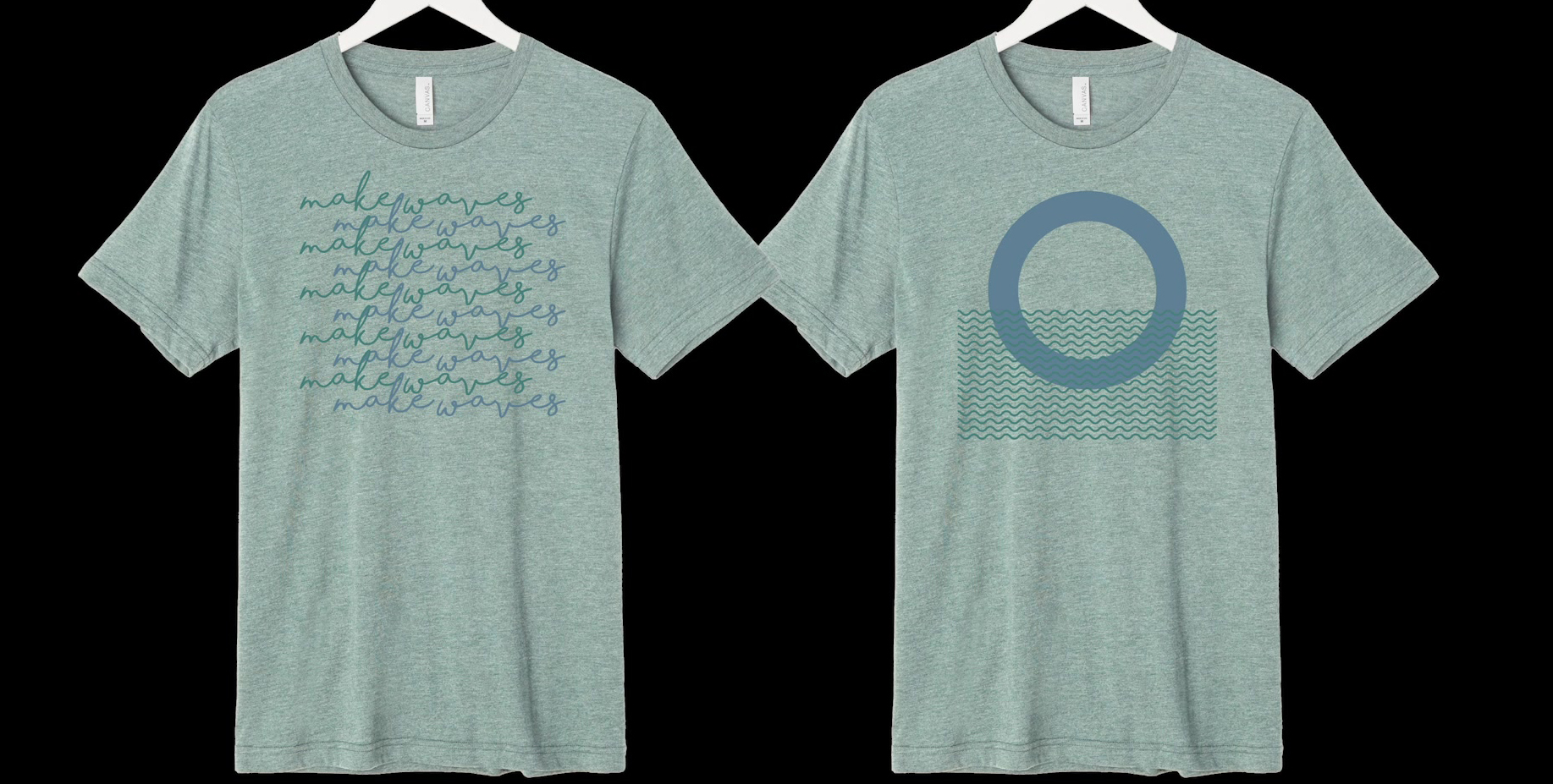
ANALOGOUS COLORS
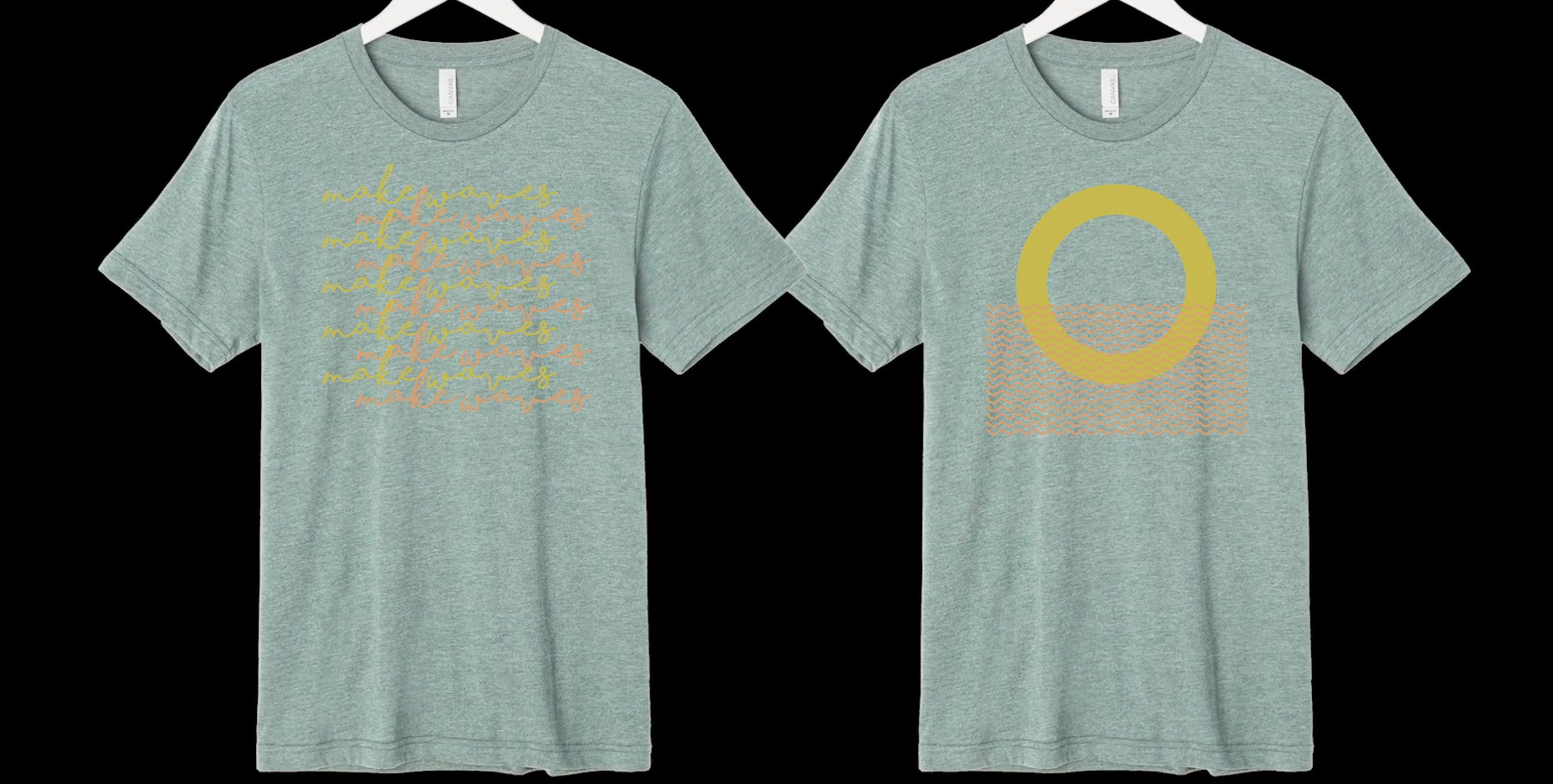
Analogous colors are located next to each other on the color wheel. They usually match well and give off a seamless, low contrast harmony. Examples are blue and green or yellow and orange.
We hope this gives you a better idea of choosing the right color for your designs. Don’t forget to check out the video above to see the examples in action, and let us know in the comment section of the video which examples you liked best!
Also, don’t forget you can find out the exact Pantone colors of our tees on our digital color card, and you can also get images to use as mockups on our image gallery.
Happy designing!
8 Comments
eric
This video was very informative. I liked how it showed you that some colors go well together & some do not.
Frank
I love the video. I know it sounds strange, but even though we have presses in-house, and even on easy colors like white or ash, we rarely pick a custom 3 or 4-digit Pantone color. We usually resort to 286, 186, 130, etc. We will be much more adventurous.
BELLA+CANVAS
Cool! Let us know how it goes!
Chris
The video was great. Lots of good information about colors of garments and colors of inks.
BELLA+CANVAS
Glad you got something out of it! We love hearing from our readers!