Color Theory: How Color Relationships Work with Apparel
Color plays a vital role in design and everyday life. It can draw your eye to an image, evoke a certain mood or emotion, even communicate something important without using words at all (traffic light). So how do we know what colors look good together and which ones don’t? The answer is simple: color theory. Artists and designers have followed color theory for centuries, but anyone can learn more about it. It can help you feel confident in many different situations, whether it’s choosing colors for a design or putting together the perfect apparel collection. With a little insight, you’ll be looking at color in a whole new way.
Color 101: Learning the Basics
First, let’s start with the basics. There are two main categories for how colors can work together. These are: Primary and secondary colors. Primary colors are: red, blue, and yellow. Secondary colors are the colors in between the primary colors. Orange, Green, Purple (lilac). If we mix primary colors with secondary colors, we get more in-between shades like red-orange, yellow-green and so forth. All together, they form what is called a color wheel.
If we go one step further we start to look at hue, saturation and value. These terms will help you understand more nuanced colors like all those little paint chips you’ll find at a home improvement store.
- Hue: another word for shade.
- Saturation: refers to the intensity—in other words, whether the color appears more subtle or more vibrant. Highly saturated colors are brighter or richer while desaturated colors have less pigment.
- Value: gives us many different shades in-between.
CREATING COLOR SCHEMES
So how do we put this all together to create professional-looking color schemes? There are formulas already created based on something called color harmony that can help. Color harmony uses the color wheel to illustrate different colour combinations. Some of the most common types of color combos are as follows:
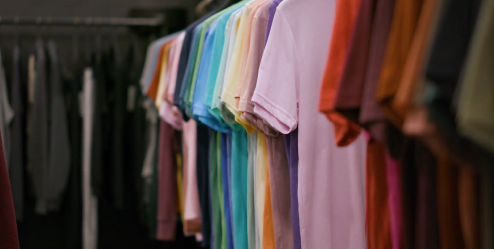
- Monochromatic design is an easy way to form harmony, especially with your apparel collection. Pick one spot colour and adjust the saturation and values making it lighter or darker to make different variations. When choosing this scheme, you are guaranteed to match because the colors are all from the same family. You’ll see this use of color on apparel from your favorite brands in retail stores today.
- Analogous(ah-nal-a-gus) colour schemes use colors that are next to each other on the wheel (like blue and green).
- Complementary colors are opposite each other on the wheel; for instance red and green. You can add variety to these selections by including lighter, darker or desaturated tones.
- A split complementary scheme uses the colors on either side of the complement.
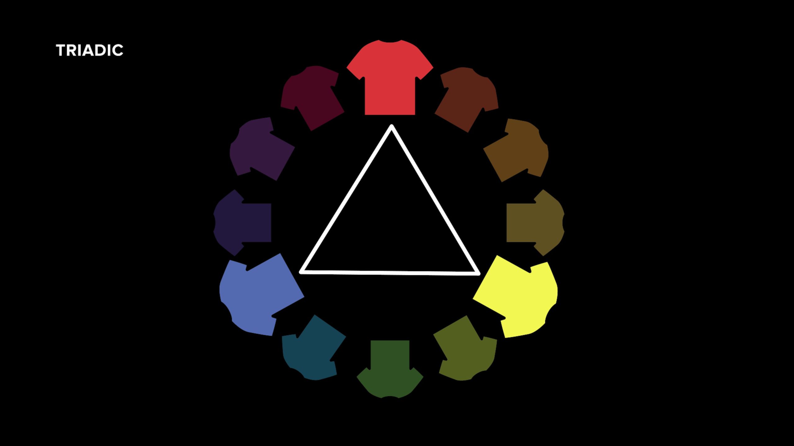
- Triadic schemes uses three colors that are evenly spaced on the color wheel, and it forms a perfect triangle.
- Tetradic schemes form a rectangle on the wheel using 2 complementary pairs. This formula works best if you let one color dominate while the others serve as accents.


Keep it Simple
It’s all about balance when choosing your different color combinations for your next apparel collection—the more colors you use the more complicated it gets to balance your artwork. My advice? Don’t complicate things too much. Contrasting colors can create balance when used correctly, (just be careful not to use colors that conflict or vibrate with each other as it can be confusing or irritating to look at, example: Red and blue or red and orange).
Where text is concerned, make sure you present the contrast between text and a background colour to ensure legibility of the text which is really important to convey your message effectively and professionally. Colors that clash or don’t contrast well can be jarring on the eyes.
Whether you are looking to start your very first apparel line, or you’re wanting to add more to your collection, understanding these key rules will help you curate the perfect collection. These rules are great to use when designing and merchandising as well.
_____________
Check out our color-forecasting article! Click here.
Have you seen our extensive 2020 Trend Report? Click here.
Want to learn more about BELLA+CANVAS? Click here.
Interested in learning more about Coloro? Click here.
Subscribe to our YouTube channel! Click here.


5 Comments
Tab
Just a tip the t shirts are cool but if you’re looking for something more like thousands of custom gifts then you have to check this site out http://www.ten30designs.com ps i just wish i would have found this site a year ago when my sister got marry 🙁
Sameerah Saabir-Brown
How many designs/color options should I start with when creating a new T-shirt line?
BELLA+CANVAS
Hi Sameerah, thank you for contacting us! I would definitely recommend checking out our blog and YouTube channel, we have plenty of tips and tricks on creating a new t-shirt line! https://blog.bellacanvas.com/how-to-start-t-shirt-business/ and https://blog.bellacanvas.com/how-to-start-screen-printing-business/ and https://blog.bellacanvas.com/choose-best-blank-garments/ and https://blog.bellacanvas.com/10-tips-starting-clothing-line/