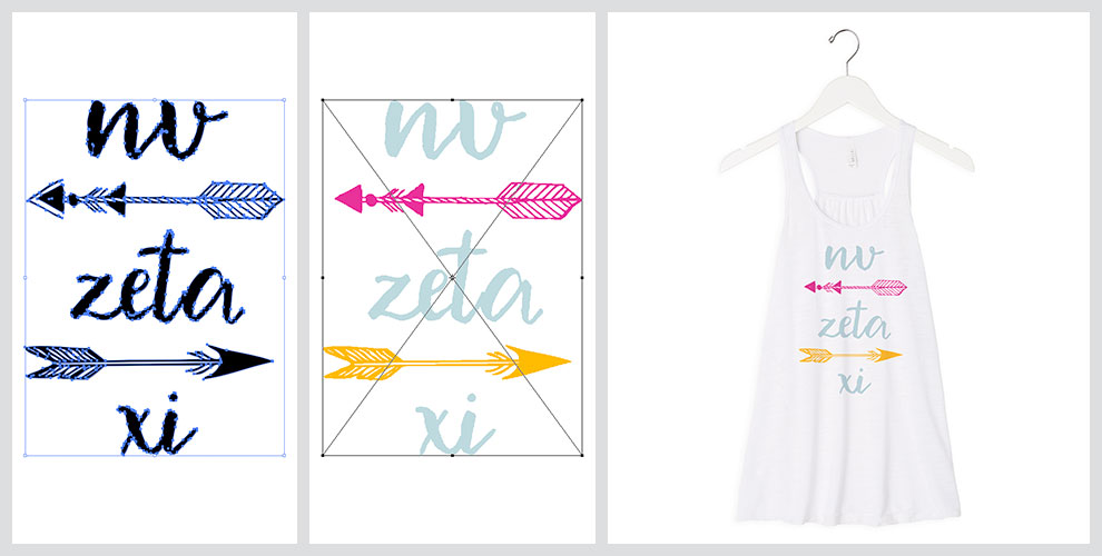
It’s easy to turn a regular T-shirt design into something truly spectacular by simply taking a few minutes to optimize your artwork. Thanks to Jerid Hill’s article, Optimizing Art: How to Create the Best Art for Direct-to-Garment Printing, we have outlined some universal and general rules that are important to follow, no matter which direct-to-garment printer you use.
RGB Design and Print
One of the simplest ways to get more out of your T-shirt printing designs is to create your artwork in RGB (red, green and blue). Your printer will use CMYK (cyan, magenta, yellow and black), but designing in RGB allows you to create clearer color patterns. This is a result of the digital textile inks that are used in direct-to-garment printers not typically reflecting true CMYK color and values.
As a result, RIP software makes it possible to intensify the colors used on your design which might otherwise appear dull when printed on regular paper and other materials. So, by designing in RGB, you can ensure that your file projects the quality and bold colors you want, despite being smaller in size.
Transparency and White Ink
If your printer is able to print white ink then it is best practice to create artwork with a transparent background. Though all software is different, creating transparent backgrounds is pretty simple.
When you create this transparent background, file size is reduced as a result of file data being reduced. No actual pixels will be created in the file, which is the most accurate way to create a layer of white ink. Remember, though, that if you are printing a photograph or a design that is square or rectangular, a transparent layer won’t be necessary.
The two primary files that professionals export to, when using transparencies, is PNG and TIF. Typically, these file formats are available from vector-based illustration and design software like Adobe Illustrator. PNG reduces file size by removing pixels from transparent images, but remember PNG files are only used with the RGB color model. If you prefer to use CMYK, you are able to export to TIF too.
Getting Resolution Right
Sure, you can achieve decent results with a low-resolution file, but you always need to think about the print head’s resolution. Print heads will always vary in resolution, so be sure to check how many nozzles you have per channel in one linear inch.
In most direct-to-garment printers, you’ll find 1,440 nozzles in an inch, and that will include eight channels. And, in most cases, four channels will be used for CMYK and the other four will be dedicated to white ink. So, with a 1” print head, you’ll find 180 nozzles per linear inch and per channel.
To match nozzles per inch, the optimal resolution is 180 dpi – anything after that is absolutely unnecessary. You won’t notice any increase in quality with a higher resolution, but you will in fact notice a quite significant difference if you go with much less.
Though, given the differences between all direct-to-garment printers, there are other factors you need to remember. For instance, you might be able to achieve the same print quality with a 150 nozzles per channel. It all depends entirely on the brand, model and quality of your printer.
Light, Medium and Dark Tones
Printing on garments is not without its challenges, and one of the major issues people face is printing mid-tones. These are the colors that exist between the lightest and darkest areas in your image, and if there isn’t a significant difference between the dark and mid-tones, your printer may struggle to create a perfect gradient.
For this reason, it’s essential for designers to create mid-tones that stand out. Using your design software, it’s important to make your lights lighter and your darks darker.
The simplest example of how this can be a problem is if one were to print an image of a woman with long hair on a garment. The tones of hair naturally change, but in a regular print it might be difficult to see different sections of the hair. All the colors will blend together to create one shade. This results in the printed image not showing texture, and creating flat and uninspiring designs.
Every image will be different, but when preparing your design, be sure to try using duplicate layers and making changes to these duplicates. This will allow you to see if the changes you have made have separated mid-tones from lighter and darker tones – and, the layers that don’t work can simply be deleted.
Separating Tones on Photoshop
So how do you do it? It’s actually quite simple. Assuming you use Photoshop, you simply need to choose Windows at the top menu bar, and then click on Layers. In the layer panel, click and then drag the layer to the page icon at the very bottom. This will create two layers – and original and a duplicate.
To turn off the layer you’re not using, simply click the ‘eye’ button on that layer. This leaves you with just the one layer to work and experiment with.
Now, if you’re intending to control the light, dark and mid-tone areas, you’ll need to use the Level feature. Go to Image in the top menu bar, choose Adjustments and then click Levels. This will open up a panel that allows you to focus on light, dark and mid-tone sliders. As you move the sliders, the open layer will show you the differences in real time. This makes it super easy to separate the tones and prepare for print.
Let’s assume that the image we are using has high darks and lights, but everything in between these tones is quite unbalanced. The first step to balancing out these tones is to set the slides at the point where the shades just about begin to ‘ramp up’. Once you’ve done this, it’s time to focus on the middle slider. Try moving the slider towards the left and leave it at the point where the color, once again, just about begins to ‘ramp up’. This is really about balancing things out to the point that your eye notices it – and, when you’re happy, simply click on the ‘eye’ button and you’ll be able to see the huge improvement you’ve made.
Don’t just use your first result, however. Be sure to keep toggling the layer on and off so you can continually compare the two images. Gradually move the levels back down from the original point you changed them to, and comparing regularly, find a point that is the perfect balance between the original and the improved layer.
Creating Sharper Images
While enhancing the light, medium and dark tones is important to create clearer garment designs, it’s also important to consider image sharpness. While this is not always necessary to sharpen your image, it can sometimes help.
Given the difference between a screen image and a printed image, however, the sharpness will always vary. It’s easy to create an image that looks too sharp on screen, but which looks better on a printed garment. This does not mean, however, that you should create an image too sharp. Here’s how to do it right:
First, go to the menu bar and choose Filter, then Sharpen and then Unsharp Mask. This tool allows you to change sharpness by percentage, but as a general rule, be sure to keep it under 100%. Typically, designers will keep pixels at a radius of either two or less, too.
Just like with the color balancing method, you can play around with these levels and compare to the original layer. Try printing on regular paper, too, to give you an idea of how the image might look when printed on fabric.
Enhancing Color
Finally, enhancing color can help make your images ‘pop’, and on Photoshop it’s easy to change – as with many other programs. Go to the menu bar and choose Image, then Adjustments. In this drop down menu you’ll see a number of options, including Vibrancy, Color Balance, Hue/Saturation and Curves.
To change the background so that the foreground ‘pops’, you’ll need to use an option called Selective Color. In the Colors dropdown, choose the color that you want to be enhanced. So for instance, if you have a green background, you’ll need to increase the levels of the two colors that make up green – cyan and yellow.
On top of that, you can try removing all other colors from the green. This will create a much greater impact on the color of the image. Simply check the preview button and slide the magenta color all the way to 0, and the intensity will instantly increase. Simple!
Using these principles, you can adapt your settings to the images and designs you use. Every image and file will be unique, but as long as you understand the makeup of the colors and the importance of sharpness, you’ll be able to create stunning garment designs that your customers will love.
Remember, playing around with settings doesn’t take long, but it makes a whole lot of difference for your direct-to-garment designs!

2 Comments